FAELLE
Artist Studio in Brooklyn
Faelle sets homeowners up for success by helping them create a healthy environment in their home. Promote community growth by offering local artisan workshops.
PROJECT OVERVIEW —
I tapped into my imagination and dreamt up the concept for Faelle. The shop is a dual storefront with an incredible studio space for local artisans to teach the community how to craft dream pieces for their home.
This directions taps into the joyful and free-spirited nature of the brand. Using pops of bright colors and illustrative elements to bring the customers into an inspirational space. The visuals explore stylized images with organic shapes and textures.
PROGRAMS USED —
Figma
Illustrator
Photoshop
BRANDING —
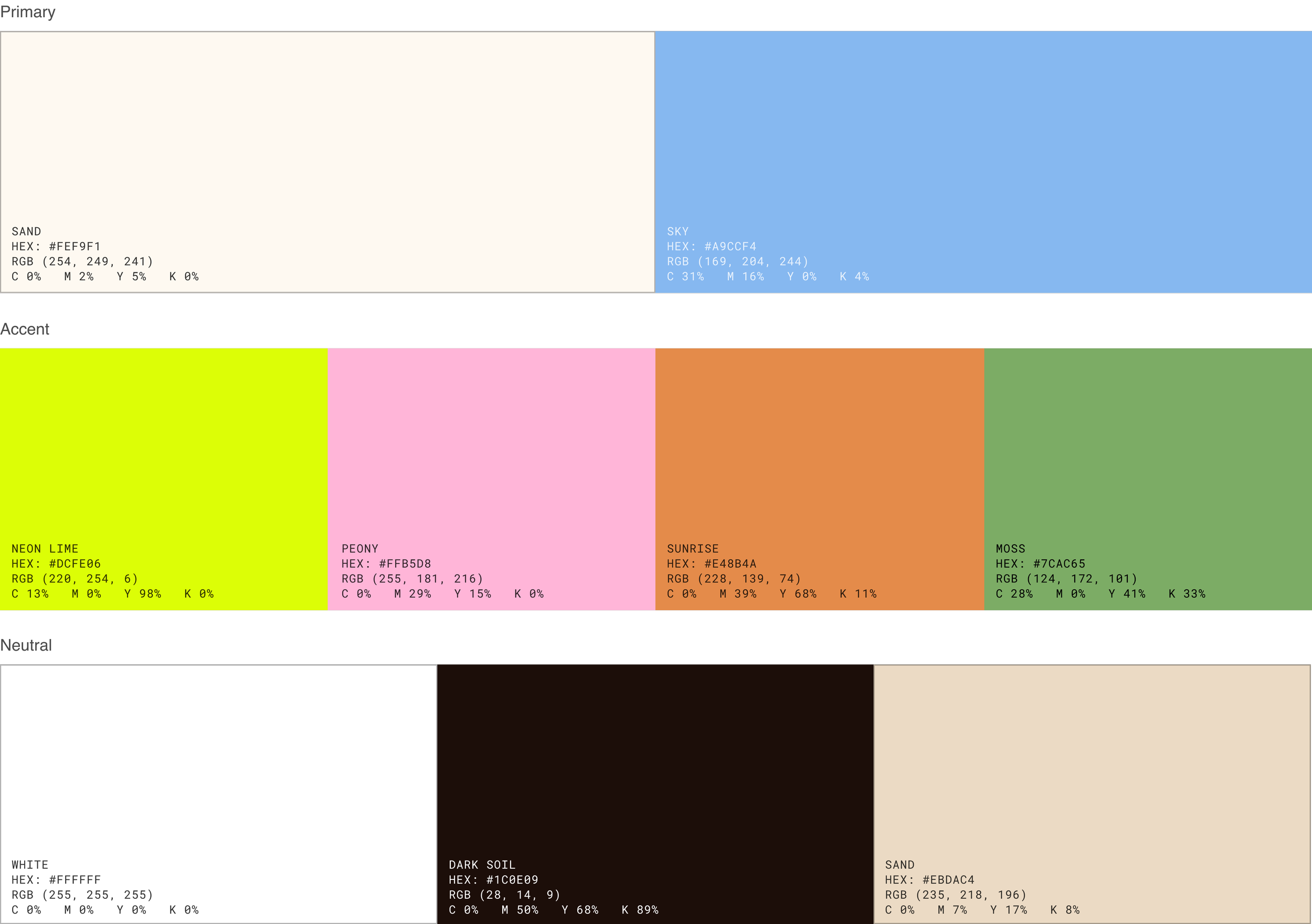
Color
This palette mixes natural tones with bright pops of color to balance the organic and cheerful elements of the brand. Eggshell, Sand, Moss, Sky, Dark Soil and Cement take inspiration from elements around the home. While Neon Lime Peony, and Sunrise are inspired by neon natural colors.
Logo
A bold and quirky wordmark that highlights the brand’s primary focus: your home. The ‘L’ has been organically altered to resemble the shape of a chair.
Typography
Subheading
Typeface: Azeret Mono
Weight: Medium
Heading
Typeface: Self Modern
Weight: Regular [Italic to highlight words]
Body
Typeface: Azeret Mono
Weight: Regular
Typography Palette
Azeret Mono is the perfect modern monospaced typeface to bring a retro feel to the details of the body and subheading. This paired with Self Modern, which brings a handwritten element to when used in italics, balances the monospaced aesthetic.


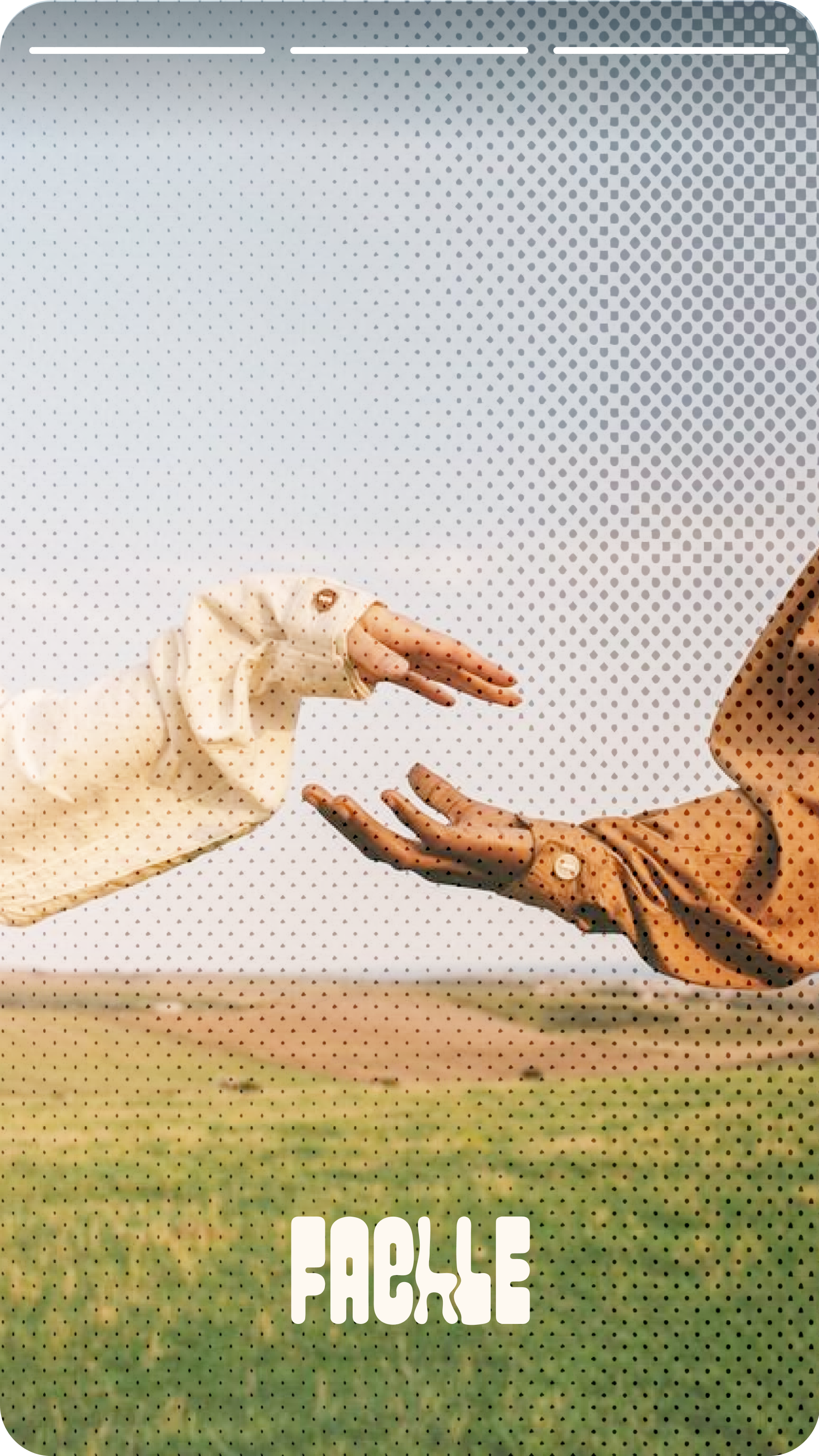
SOCIAL MEDIA
Instagram Story
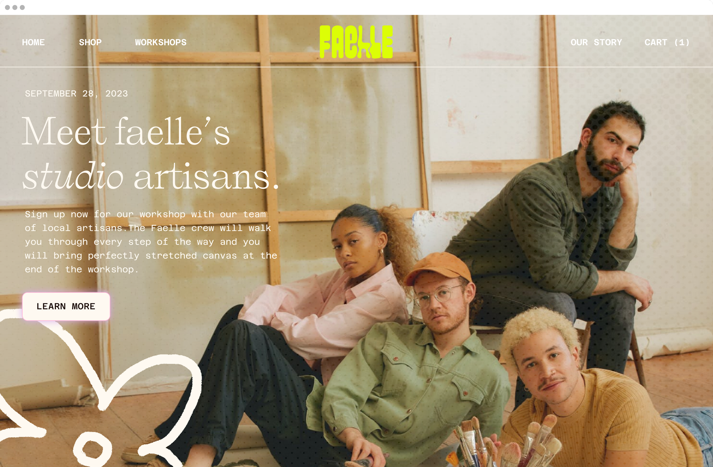
WEBSITE
Landing Page